Complicated Problems Simplified with Customized Software and Analytics Solutions to Fit your Needs
We provide you with critical insight from predictive and preventative fleet management, customized software applications and support, to fully integrated analytical reporting tools that give you confidence and control over your operation. We have a decade of success with our aviation customers in leading data science innovations and developing data-driven software solutions that result in improved productivity, lower cost, reduced risk of down time, and a more predictable future.
Our Clients
Our analytics agency is trusted by some of the biggest companies in the world
![]()
![]()
![]()
![]()
![]()

Let Us Introduce Ourselves
Our Services
Freya Systems is a data analytics and software development agency based near Philadelphia PA. We solve complex problems with elegant web and mobile solutions. Our team has years of experience in developing, integrating and optimizing information systems. We are skilled at handling big data, getting to the root of the problem and deciding a course of action to result in the most optimal solution.
We Have Empowered Our Customers to:
- Deliver a solution that increased fleet readiness by 8% and saved in excess of $100M.
- Overhaul existing MRO using AI and Machine Learning to accurately predict contributing factors and service intervals, saving millions in maintenance costs.
- Develop a production-quality workflow design web application that saved a military aviation customer and estimated $3.5M over five years.
Make Our Team Yours.

Discovering Your Solution
Just Got Easier
- 1. Tell us about your current challenges.
- 2. Receive an applicable case study and whitepaper that details our areas of previous success and how we can deliver for you.
- 3. A Lead Data Scientist will follow up and schedule a 15 minute consultation to discuss your unique situation.
The Value We Bring to Our Clients
Our Team
Our team in the Philadelphia area has the right people with the right portfolio of skills to get the job done. We recognize that our people are our value. We create an environment that allows our team to continuously pursue growth and learning, which continually strengthens their skills.
Trusted Partner
As a provider of software development and support to some of the largest high-tech companies in the world, we know that trust is one of the most important aspects of a relationship. We take pride in developing and sustaining honest and effective relationships and see this as a core foundation of our business.
Technical Solutions
We thrive on challenges and respond with balanced and effective solutions using modern technologies. Agile is baked into our workflow so that the innovative solutions we architect, design and develop, adapt as our understanding of the problem deepens. We collaborate closely with our customers to produce results that don’t just deliver but delight.
One-Stop-Shop
From concept to design and delivery we are a one-stop shop that always puts your intentions first. You can use our team as an external resource or they can be integrated into your team to get the job done. We can create a working environment that is customizable to meet the needs of your project and is designed to evolve over time.
Holistic Approach
We help to bring a holistic approach to problem-solving. It’s not just about the data or solving a specific problem – the business need is a key driver for us. We are experts at looking at the entire picture to identify what our customers can do today while also helping them move forward tomorrow.
Domain Knowledge
Experience tells us that solutions are most effective if they are developed in the context of the domain space. Our teams not only focus on developing technical skills and innovative approaches but also on understanding the domains in which they work, allowing us to effectively communicate and collaborate with our customer’s subject matter experts to gain a deeper understanding of the problem, test hypotheses and refine results.
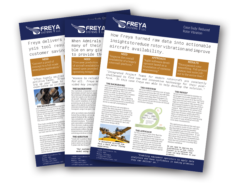
Case Studies
The Freya team loves a challenge, so when one of our clients comes to us asking for help,
we strive to answer their questions by producing an enduring solution that fits their requirements.